

The colors that bring the most light into a home are light, warm shades that reflect light well: off-white, ivory, sandy beige, greige, and pearl gray, as well as soft pastels like sky blue or sage green. A light color reflects back into the room much of the light it receives; a dark color absorbs it.
In this guide, we’ll explain why some colors make a space feel brighter than others, the 10 shades that work best in interiors, how to choose the right one based on the room’s orientation and layout, and the mistakes that make a home seem darker than it actually is.

Why do some colors appear brighter than others?
It all depends on how much light the paint reflects. Manufacturers indicate this using the Light Reflectance Value (LRV), a scale ranging from 0 (black) to 100 (pure white). To maximize light, look for colors with an LRV of 70 or higher: most whites, creams, and light pastels fall within that range. You’ll find this information in the color chart or on the paint’s product label.
The room’s orientation changes how each color looks:
- North: The light is cold and sparse. Bluish whites and cool grays appear dull. Warm tones are best: off-white, ivory, beige, or vanilla yellow.
- South: The light is warm and intense for hours on end. It works well with cool tones like sky blue or pearl gray without making the room feel dull.
- East : plenty of light in the morning and not much in the afternoon. Warm neutrals work well here, as they don’t turn gray as the afternoon wears on.
- West: soft light in the morning and orange light in the afternoon. Light greens and greige tones balance that hue.
The finish also makes a difference. A satin finish reflects slightly more light than a matte finish, but it highlights imperfections in the wall more. For walls with imperfections, a high-quality matte finish is best; here’s how to hide imperfections on walls.
The 10 Interior Colors That Make Your Home Feel Brighter
1. Off-white
It’s the color that reflects the most light without feeling cold. It has a hint of yellow, beige, or gray that softens the pure white, so the wall looks bright yet cozy. It works in any room and with any orientation, and it’s the safest choice if you’re unsure. Pair it with natural wood and earth-toned textiles.
2. Ivory or cream
A warmer shade of white with a hint of yellow. Ideal for north-facing rooms, where pure white can appear grayish. It creates a warm atmosphere in living rooms and bedrooms. It pairs beautifully with white trim and light-colored wood floors.
3. Sand Beige
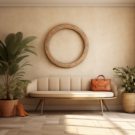
A warm neutral that reflects a lot of light and adds more character than white. Choose very light beiges: darker shades tend to absorb light. It works well in living rooms and bedrooms, and pairs well with greens, soft terracotta tones, and natural fibers. If you like these shades, check out our ideas for earth tones on walls.
4. Greige
A blend of gray and beige. It’s the most versatile neutral: it doesn’t look as cool as gray or as yellowish as beige. Perfect for open-concept living rooms with light that changes throughout the day and for homes with rooms facing different directions.
5. Pearl Gray
A very light gray with a silvery undertone. It creates a modern and elegant look and reflects light almost like white. It works best in rooms with southern or western exposure; in a north-facing room, it may appear dull. Pair it with white, light wood, and black or brass accents.
6. Pale sky blue
A very soft blue that visually enlarges the space and conveys a sense of calm. Ideal for bedrooms and bathrooms with plenty of natural light. In north-facing rooms, choose a blue with a hint of gray or green so it doesn’t feel too cold.
7. Light sage green
A soft, natural green with a hint of gray. It brings a sense of freshness and light without straining the eyes. It works very well in kitchens, bedrooms, and living rooms with plants. It pairs well with off-white, wood, and handmade ceramics.
8. Vanilla Yellow
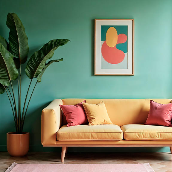
A very pale yellow that mimics sunlight in rooms that don’t get any. It’s the best choice for dark interior rooms and hallways. Be careful with bold yellows: they can be tiring on the eyes and make the space feel smaller.
9. Powdery Pink
A very muted pink, almost nude. It casts a warm, flattering glow and looks sophisticated in bedrooms, walk-in closets, and bathrooms. Use the lighter shade so it doesn’t look childish, and pair it with light gray or white.
10. Mild Lavender
A very light lilac with a grayish undertone. It reflects light well and creates a relaxing atmosphere. It works well in bedrooms and reading areas, especially those with natural light from the south. Pair it with whites and silver tones.
Summary Table: Which Color to Choose
| Color | Effect | Ideal Stay | Guidance |
|---|---|---|---|
| Off-white | Maximum light, cozy | Any | All |
| Ivory or cream | Warm and bright | Living room, bedroom | North |
| Sand Beige | Natural Warmth | Living room, bedroom | North, East |
| Greige | Versatile neutral | Open living room, hallway | All |
| Pearl gray | Modern and elegant | Living room, kitchen | South, west |
| Pale sky blue | Spaciousness and tranquility | Bedroom, bathroom | South |
| Light sage green | Natural Freshness | Kitchen, bedroom | West, south |
| Vanilla Yellow | Simulates sunlight | Hallway, interior rooms | North, no window |
| Powdery pink | Warm, soft light | Bedroom, walk-in closet | East, South |
| Mild Lavender | Relaxing | Bedroom, reading area | South |
Which Color to Choose Based on the Room
- Dark living room: off-white or greige on the walls and a white ceiling. If you want color, use it on just one wall—the one that gets the most light—so as not to make the whole room feel dark. Enhance the space with good indirect lighting in the living room.
- A hallway without natural light: vanilla yellow, ivory, or off-white. Also paint the doors and baseboards in light colors so the hallway doesn’t feel like a tunnel. More ideas on how to renovate and decorate a narrow hallway.
- Bedroom: sky blue, sage green, dusty pink, or very light lavender. These colors brighten the room and help you relax.
- Kitchen: off-white, pearl gray, or sage green. It pairs well with light-colored countertops and white or wood cabinetry.
- Windowless bathroom: off-white or ivory, with light-colored tiles and large mirrors. Avoid dark grays and deep blues.
Tips for Making Your Home Look Brighter
- Paint the ceiling a shade lighter than the walls, or pure white. It reflects light downward and makes the room appear taller. If you’re planning to do this, our guide to painting ceilings will help you.
- Use the same color scheme throughout the house. Changing the color scheme in each room visually breaks up the space.
- Place mirrors in front of the windows to reflect more natural light.
- Choose light-colored floors, curtains, and furniture. A dark floor absorbs much of the light reflected by the walls.
- Test the color before painting. Paint a sample of at least one square meter and look at it in the morning, in the afternoon, and under artificial light.
Mistakes That Make a House Look Dark
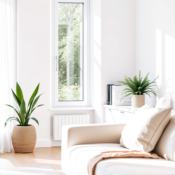
- Using pure bluish white in a north-facing room: it looks gray and cold.
- Paint everything in dark colors in a house with little natural light.
- Choosing a glossy finish for walls with imperfections: the light hitting the surface highlights every flaw.
- Don’t rely on the color chart: the same shade can look very different depending on the lighting in your home.
- Forget about artificial light: cool-toned bulbs make warm colors look dull. For living rooms and bedrooms, warm or neutral light is best.
Conclusion
To bring more light into your home, choose light colors with a high reflectivity and adapt them to the room’s orientation: warm tones in north-facing rooms and cool pastels in rooms that get plenty of sunlight. Complete the look with white ceilings, light-colored floors, and mirrors. And if you’re looking for a cool, refreshing feel for the summer instead of just light, check out our color guide for a cool home. At Paratureforma, you’ll find paints, primers, and everything you need to paint your home.
Which color makes a room brighter?
Off-white, because it reflects almost as much light as pure white without looking cold. Next are ivory, greige, and very light pastels. Look for paints with a light reflectance value (LRV) of 70 or higher.
What color should I paint a dark living room?
In off-white, ivory, or greige, with a white ceiling. If the living room faces north, avoid bluish whites and cool grays, which look dull. Add mirrors and indirect lighting to enhance the effect.
What is the best color for a hallway with no natural light?
Vanilla yellow or ivory, because they mimic natural light. Also paint the doors and baseboards in a light color and use wall sconces so the hallway doesn’t look like a tunnel.
White or beige to make the house feel brighter?
Off-white adds a little more brightness; light beige adds more warmth. In rooms facing north or with low light, a very light beige or ivory may be more pleasing than white, which tends to look gray in those settings.
Does satin paint reflect more light than matte paint?
Yes, a little more, because it reflects light rather than absorbing it. But it also makes any imperfections in the wall stand out more. Use satin on smooth, well-prepared walls, and matte on walls with imperfections.
What colors make a room look bigger?
Light, cool colors—such as sky blue, pearl gray, or light sage green—because they make the walls appear farther away. Painting the walls and ceiling the same light shade also blurs the boundaries and makes the space feel larger.